Most, if not all websites use images to enhance the reader’s experience and make the page look more presentable. However, sometimes the perfect photo does not have the necessary dimensions, or simply does not fit the style. This section will be dedicated to understanding image formatting and styling in HTML.
Basic Image Implementation/Hyperlinks
Back in Part 1 of this series, we explained how to add an image to your webpage. For review, <img src=”(link)”> simply pastes the image, and adding an alt attribute after the link ensures that text appears in place of the image should it not load.
Hyperlinks can be implemented using <a href=”(link)”> (text) </a>, displaying a line of (text) with a hyperlink to (link).
Sizing Images
Attributes called width and height can be used to change the width and height of the image. Be sure to surround your dimension values in quotes!
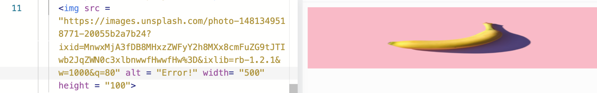
As you can see, since we set the width to 5x the height, the image comes out stretched.
Possibly add section about changing dimensions using CSS
Image Aesthetics
Borders
In your respective ruleset, border is used to add a border. Note that the second argument(text style) is required, otherwise the border won’t appear.
Rounded Corners/Circular Images

Adding an extra element border-radius will add rounded corners to your image. A larger radius results in a rounder shape, and a smaller radius will do the opposite.
Setting border-radius to 50% will make the image round.


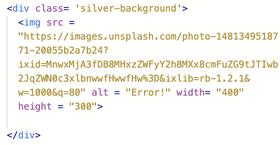
Background Color of Div
Surrounding our image with a div element with a reference to a CSS styling ruleset encloses the image in our selected CSS style – using background-color: silver; we can set the background color to silver.

Padding/Margins
Padding adds space between the element’s content and the element’s border. As you can see, padding this element results in extra silver background, extending the borders of the actual HTML element.

Some extensions of this attribute include padding-top, padding-left, padding-right, and padding-bottom. Pretty self explanatory – using these attributes, respective sides will independently be padded. To shorten the code, it is possible to individually change each side in one line by using the syntax padding: (top)px (right)px (bottom)px (left)px;. This format is called Clockwise Notation.
Margins are easily confused with padding, as they both deal with extending the space outside the image and other elements. Margins add whitespace outside an element’s border, but leave the actual size of the element the same.
Single-side margins are also possible using margin-top, margin-left, margin-right, and margin-bottom. Clockwise notation can also be used with margins.